
Living in a small space is becoming increasingly common in today’s urban environments. Whether you’re working with a compact apartment, a cozy bedroom, or a petite living room,

the right color strategy can add visual square footage without knocking down a single wall. This comprehensive guide reveals the science-backed color choices that interior designers use to transform cramped spaces into airy sanctuaries.
Understanding the Psychology and Science of Color in Small Spaces
Before diving into specific colors, it’s crucial to understand why color impacts our perception of space. Our brains process visual information through a complex interplay of light reflection, shadow interpretation, and learned spatial cues.
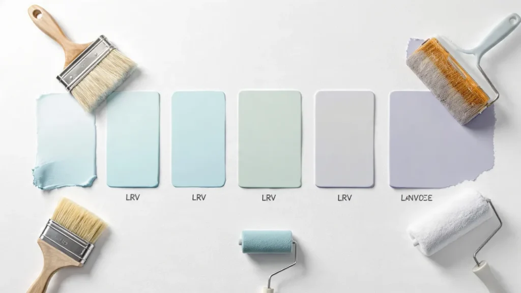
Light Reflection Value (LRV) is the key metric designers use. This scale runs from 0 (absolute black, absorbing all light) to 100 (pure white, reflecting all light).
Colors with an LRV above 50 are generally considered light, while those below 50 are dark. For small rooms, aim for colors with an LRV of 60 or higher to maximize the space-expanding effect.
Cool colors recede while warm colors advance. This isn’t just design folklore—it’s rooted in atmospheric perspective. In nature, distant objects appear cooler and lighter due to atmospheric haze. Our brains interpret cool-toned walls as farther away, effectively pushing back the boundaries of your room.
The Best Colors That Make Small Rooms Look Bigger
1. Pure White and Off-Whites (LRV: 85-95)
Pure White is the undisputed champion of space expansion. Colors like Benjamin Moore’s “Chantilly Lace” or Sherwin-Williams’ “High Reflective White” bounce maximum light around your room, creating an almost ethereal openness.
Warm Whites include shades with yellow or beige undertones like “Swiss Coffee,” “Ivory White,” or “Vanilla Milkshake.” These create a cozy yet spacious feel, perfect for bedrooms and living rooms where pure white might feel too clinical.
Cool Whites feature blue or gray undertones (think “Decorator’s White” or “Snowbound”) and work beautifully in modern spaces, bathrooms, and kitchens. They maintain crispness while expanding space perception.
Pro Application Tip: Use the same white on walls, trim, and ceiling to eliminate visual boundaries. This monochromatic approach creates seamless continuity that tricks the eye into seeing one expansive surface rather than defined, limiting walls.
2. Soft Grays (LRV: 60-75)
Gray has dominated interior design for good reason—it’s sophisticated, versatile, and exceptionally effective in small spaces when chosen correctly.
Light Grays with Warm Undertones: Colors like “Agreeable Gray,” “Repose Gray,” or “Pale Oak” provide subtle warmth while maintaining that space-expanding lightness. These work wonderfully in living rooms and bedrooms.
Cool Grays: Shades like “Silver Strand,” “Light French Gray,” or “Gray Owl” bring contemporary elegance and pair beautifully with white trim and modern furnishings.
The Gray Caution: Avoid grays with an LRV below 55, as they can make small rooms feel cave-like. Always test samples in your specific lighting conditions—gray is notoriously changeable depending on natural and artificial light.
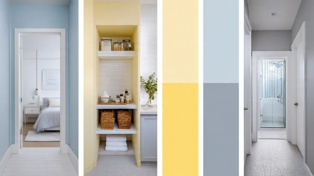
3. Soft Blues (LRV: 60-80)
Blue is psychologically associated with sky and water—inherently expansive elements—making it ideal for small spaces.
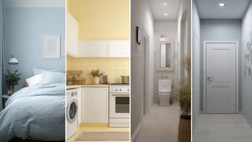
Powder Blue: Shades like “Breath of Fresh Air,” “Iceberg,” or “Palladian Blue” create serene, spa-like atmospheres while visually expanding walls. These work exceptionally well in bathrooms, bedrooms, and home offices.
Sky Blue: Colors like “Atmospheric” or “Blue Ground” evoke open skies and literally make ceilings feel higher. Consider using a slightly lighter blue on the ceiling than on walls for maximum height illusion.
Gray-Blue Hybrids: These sophisticated shades (“Sea Salt,” “Rainwashed,” “Silver Strand”) offer the best of both worlds—the contemporary appeal of gray with the receding qualities of blue.
Application Strategy: In rooms with limited natural light, blue can sometimes read as cold. Pair blue walls with warm-toned wood furniture and brass or gold accents to maintain coziness while benefiting from the spatial expansion.
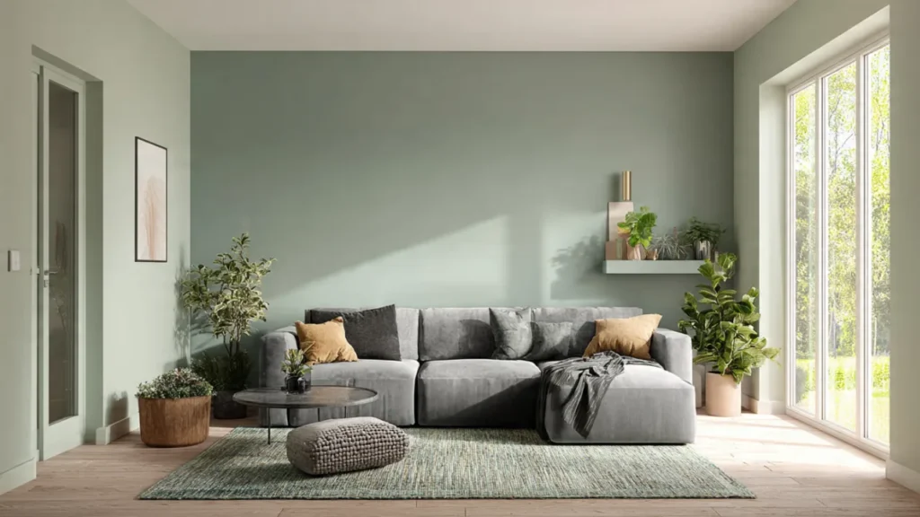
4. Gentle Greens (LRV: 60-75)
Green connects us to nature and has proven calming effects while offering excellent space-expanding properties.
Sage Green: Colors like “Sea Salt,” “Softened Green,” or “Clary Sage” bring organic tranquility and work beautifully in bedrooms, bathrooms, and living spaces. The muted quality prevents overwhelming small rooms.
Mint Green: Lighter, cooler greens like “Mint Condition” or “Acapulco Cliffs” feel fresh and airy, perfect for kitchens, bathrooms, and craft rooms.
Gray-Green: These sophisticated neutrals (“Dried Thyme,” “Retreat,” “Silver Sage”) offer the space benefits of cool colors while maintaining versatility for various decor styles.
5. Soft Lavenders and Pale Purples (LRV: 65-78)
Often overlooked, pale purples offer unique benefits for small spaces.
Lavender: Shades like “Lite Lavender,” “Lazy Lavender,” or “Elusive Lavender” create dreamy, romantic atmospheres while maintaining the receding quality of cool colors. Ideal for bedrooms and creative spaces.
Gray-Lavender: These modern neutrals combine purple’s soothing qualities with gray’s sophistication, working well in contemporary small spaces.
6. Pale Yellows and Creams (LRV: 75-85)
When you want warmth without sacrificing spaciousness, pale yellows excel.
Buttery Yellows: Soft shades like “Lemon Chiffon,” “Buttercream,” or “Hawthorne Yellow” bring sunshine and cheer while reflecting abundant light. Perfect for north-facing rooms that need warmth.
Cream: Neutral creams with yellow undertones offer timeless appeal and work in virtually any style, from traditional to contemporary.
Advanced Color Strategies for Maximum Space Perception
The Monochromatic Method
Using variations of a single color throughout a room eliminates visual stops and creates flowing continuity. Here’s how to execute it perfectly:
Choose your base color in the lightest value (LRV 70-85). Use this on walls.
Go lighter for the ceiling by choosing a shade 10-20% lighter than your wall color, or simply use pure white. This draws the eye upward and increases height perception.
Trim treatment: Either match trim to walls for seamless flow, or use pure white trim to create clean, crisp boundaries that actually enhance the sense of organization and space.
Floor consideration: Keep flooring light or medium-toned. Dark floors can anchor a room beautifully, but they also visually shrink floor space. Light wood, pale tile, or neutral carpet maximizes openness.
The Ombré Ceiling Technique
This advanced technique creates dramatic height illusion. Paint your ceiling the lightest shade, walls a medium tone, and the lower third of walls (or just baseboards) a slightly darker shade. This vertical gradient mimics natural light patterns and makes ceilings appear to soar.
The Feature Wall Strategy
While conventional wisdom says to paint small rooms one light color, a strategic accent wall can actually add depth dimension rather than shrinking space—if done correctly.
Choose the farthest wall from the entry point. Painting this wall a slightly darker or more saturated version of your main color creates depth perception through atmospheric perspective.
Avoid dark or bold accent walls on side walls, as these compress space width. The back wall technique pushes visual boundaries outward instead.
Paint Finish Matters More Than You Think
The sheen level of your paint dramatically affects light reflection and space perception.
Flat/Matte (5-10% sheen): Absorbs light and minimizes imperfections but reduces space-expanding reflection. Use only if walls have significant texture issues.
Eggshell (10-25% sheen): Offers subtle sheen that gently reflects light while hiding minor imperfections. Good compromise for small living rooms and bedrooms.
Satin (25-35% sheen): Reflects significantly more light, enhancing spaciousness. Excellent for small spaces, easy to clean, ideal for high-traffic areas, kitchens, and bathrooms.
Semi-Gloss (35-70% sheen): Maximum light reflection creates dramatic space expansion but highlights every wall imperfection. Best reserved for trim, doors, and cabinets in small rooms, or for perfectly smooth walls in bathrooms and kitchens.
Designer’s Secret: Many professionals use eggshell on walls and satin on ceilings in small rooms. The increased ceiling sheen bounces light downward, amplifying brightness without the harsh look of semi-gloss.
Room-by-Room Color Recommendations
Small Bedrooms
Best choices: Soft blues (promotes sleep), pale lavenders (calming), warm whites (cozy)
Avoid: Deep reds and oranges (too stimulating, visually advancing)
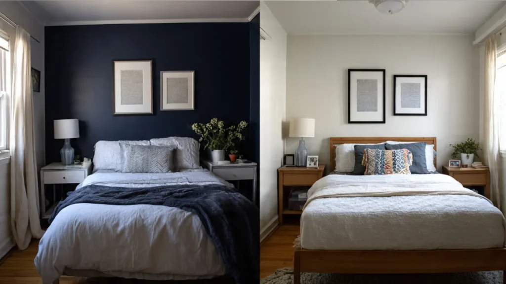
Special tip: Paint the wall behind your bed 2-3 shades darker than other walls to create depth and a focal point without shrinking the room.
Compact Living Rooms
Best choices: Warm grays, greige, soft sage, pale blues
Avoid: Dark browns, deep colors that absorb light from what’s typically the home’s social hub
Special tip: Extend your wall color onto built-in shelving or bookcases to make them “disappear” and create seamless flow.
Tiny Bathrooms
Best choices: Pure white, powder blue, sea foam green, pale gray-blue
Avoid: Dark colors unless you’re going for a dramatic powder room effect (and have excellent lighting)
Special tip: Use high-gloss or semi-gloss finish in bathrooms. The moisture resistance is practical, and maximum light reflection makes tiny bathrooms feel more spacious.
Small Kitchens
Best choices: Soft white, light gray, pale yellow, mint green
Avoid: Bold, saturated colors that can overwhelm in a room with many visual elements (cabinets, appliances, countertops)
Special tip: Paint upper cabinets your wall color and lower cabinets a complementary light neutral. This creates visual height and prevents the “boxy” feeling common in small kitchens.
Narrow Hallways
Best choices: Light neutrals, soft whites, pale cool colors
Special tip: Paint the end wall of a hallway a shade darker than the side walls. This shortens long, tunnel-like hallways visually, making them feel more proportionate rather than cramped.
Colors to Avoid in Small Rooms (and Why)
Dark Colors (LRV Below 40)
Navy, charcoal, chocolate brown, deep burgundy absorb light rather than reflecting it, making walls feel closer and rooms smaller. However, these can work in specific scenarios:
- Powder rooms where “cozy” is desirable
- As accent walls on the farthest wall only
- In rooms with exceptional natural light and high ceilings (10+ feet)
- When deliberately creating intimate, cocoon-like spaces
Highly Saturated Colors
Bright red, royal blue, emerald green, sunny yellow demand attention and visually advance toward you, shrinking perceived space. These bold colors work beautifully as accessories, artwork, and textiles but overwhelm as wall colors in small rooms.
Stark Black
Pure black (LRV 0-5) creates dramatic, sophisticated spaces but is the ultimate space-shrinker. Reserve black for trim details, door frames, or window frames against light walls—this creates striking contrast that actually enhances spaciousness through defined boundaries.
Complementary Strategies to Maximize Your Color Choice
Your color choice is just one element of creating spacious-feeling small rooms. Combine these strategies for maximum impact:
Lighting Strategy
Layer your lighting: Combine ambient (overhead), task (desk/reading lamps), and accent lighting (wall sconces, picture lights). Multiple light sources at different heights create visual complexity and depth.
Use uplighting: Floor lamps or wall sconces that direct light upward highlight your light-colored ceiling and make rooms feel taller.
Maximize natural light: Use sheer curtains or no window treatments at all. If privacy is needed, consider top-down bottom-up shades that allow light in while maintaining privacy.
Mirror Placement
Opposite windows: Position large mirrors directly across from windows to double perceived natural light and create the illusion of another window.
Strategic corners: Place floor-length mirrors in corners to create depth and make rooms feel less boxy.
Mirrored surfaces: Consider furniture with mirrored elements, mirrored backsplashes in kitchens, or mirrored closet doors.
Furniture Selection
Match walls: Choose furniture in similar tones to your wall color so pieces visually recede rather than breaking up space.
Leggy furniture: Pieces with visible legs (rather than solid bases) allow light to flow underneath, creating airiness.
Glass and acrylic: Transparent furniture maintains functionality without visual bulk.
Decluttering
Even the perfect paint color can’t overcome clutter. In small spaces, every item should earn its place. Use closed storage to minimize visual noise and maintain the spacious feeling your color creates.
Testing Colors Before Committing
Never choose paint from a tiny chip alone. Here’s the professional method:
- Purchase samples of your top 3-4 color choices
- Paint large swatches (at least 2′ x 2′) on different walls to see how light affects the color throughout the day
- Observe for 3-5 days in morning, afternoon, and evening light
- Test with your existing elements (flooring, furniture, curtains) to ensure harmony
- Check undertones by comparing swatches to pure white—you’ll clearly see if your “gray” is actually purple-gray or green-gray
Common Mistakes to Avoid
Matching paint chips in store lighting: Store fluorescent lighting distorts colors dramatically. Always test at home.
Ignoring undertones: That “perfect gray” might have strong blue, green, or purple undertones that clash with your flooring or furniture.
Painting before clearing the room: Paint looks different against blank walls versus walls with furniture casting shadows.
Using too many colors: In small spaces, limit yourself to 2-3 colors maximum for cohesive flow.
Forgetting about adjacent rooms: Colors should transition naturally from room to room. If your hallway is warm gray, avoid cool blue in an adjoining bedroom—the contrast will make both spaces feel smaller.
Trending Paint Colors for Small Spaces in 2025
Warm Minimalism: Soft, warm neutrals like greige, warm white, and biscuit create cozy yet spacious feelings aligned with current design trends.
Sage and Green Tones: Biophilic design (connecting with nature) remains strong, making soft greens increasingly popular for small urban spaces.
New Neutrals: Complex neutrals with multiple undertones (gray-green, gray-lavender, greige-blue) offer sophistication and depth while maintaining spaciousness.
Earthy Whites: Warmer whites with cream, sand, or clay undertones replace stark cool whites for more welcoming small spaces.
The Bottom Line: Creating Your Space-Expanding Color Strategy
The most effective color strategy for small rooms combines light value (LRV 60+), cool or neutral temperature, and appropriate sheen (eggshell to satin). Whites, soft grays, pale blues, and gentle greens consistently deliver maximum space-expanding impact.
However, the “best” color ultimately depends on your specific room’s lighting, purpose, existing elements, and your personal style preferences. A north-facing room needs different colors than a south-facing one. A bedroom requires different considerations than a home office.
Start with light, lean cool rather than warm if uncertain, test extensively before committing, and remember that proper lighting, strategic mirror placement, and thoughtful furniture selection work synergistically with your color choice to transform your small space into an airy, welcoming environment.
With these expert strategies, you’re now equipped to choose colors that don’t just make your small room look bigger—they make it feel genuinely spacious, comfortable, and uniquely yours. The right color isn’t about following trends or rules rigidly; it’s about understanding the principles and applying them to create a space that expands both visually and emotionally.
Also Read: Modern Small Bedroom Interior Design with Wardrobe: Space-Saving Ideas for 2025