
Before diving into specific color recommendations, it’s important to understand how colors affect our emotions and physiology. Color psychology studies reveal that different hues trigger distinct psychological and physical responses:
- Cool colors (blues, greens, purples) tend to lower heart rate and reduce stress
- Neutral tones create a sense of balance and grounding
- Soft, muted shades are easier on the eyes and promote restfulness
- Warm, pale colors can provide comfort without overstimulation
Top 7 Most Relaxing Colors for Living Rooms
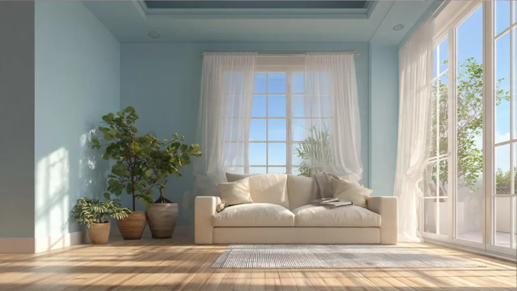
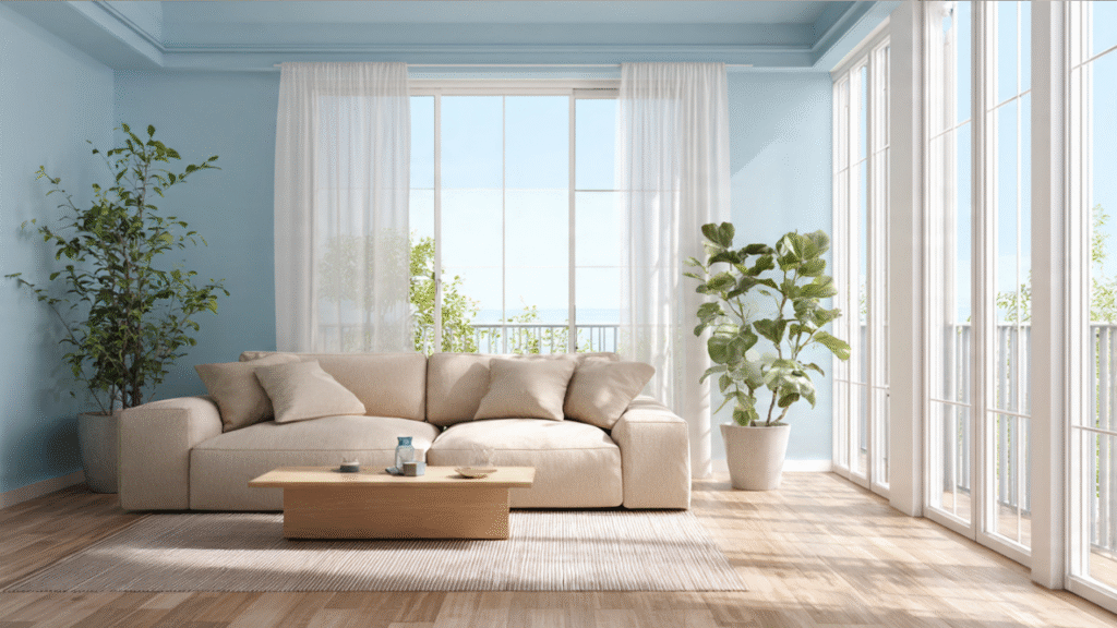
1. Soft Blue – The Ultimate Stress Reliever
Blue consistently ranks as the most relaxing color for interior spaces. This calming hue evokes feelings of serenity, stability, and peace.

Best Shades:
- Powder blue
- Sky blue
- Seafoam blue
- Periwinkle
Why It Works: Studies show that blue can actually lower blood pressure and heart rate, making it scientifically proven to reduce stress. It mimics the tranquility of the sky and ocean.
Design Tip: Pair soft blue walls with white trim and natural wood accents for a coastal-inspired calm atmosphere.
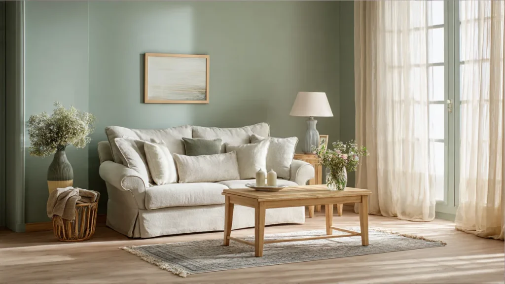
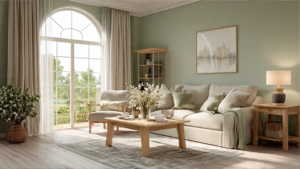
2. Sage Green – Nature’s Tranquilizer
Green represents nature, growth, and harmony. Sage green, in particular, offers a sophisticated, earthy tone that brings the outdoors in.
Best Shades:
- Sage green
- Mint green
- Celadon
- Eucalyptus
Why It Works: Green is easiest on the eyes and is associated with balance and renewal. It creates a restorative environment perfect for relaxation.
Design Tip: Combine sage green with cream upholstery and brass accents for an elegant, calming space.
3. Warm Gray – Modern Serenity
Gray has evolved from boring to sophisticated, offering a neutral backdrop that promotes calm without feeling cold.
Best Shades:
- Warm greige (gray-beige)
- Dove gray
- Taupe gray
- Mushroom
Why It Works: Neutral grays provide visual rest and create a sense of spaciousness. They’re incredibly versatile and timeless.
Design Tip: Layer different textures in similar gray tones to add depth while maintaining tranquility.
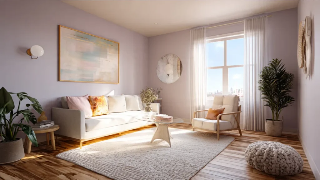
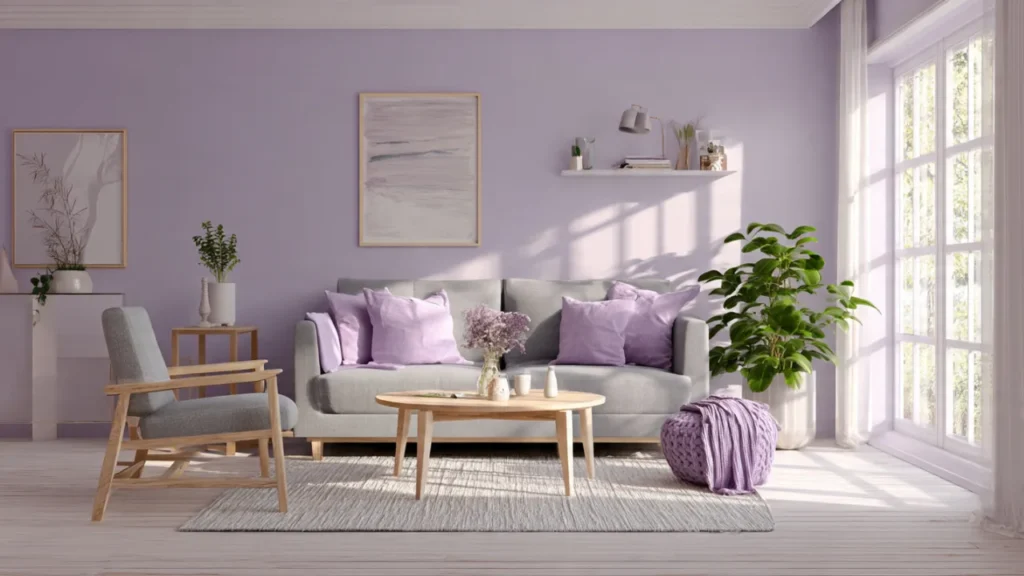
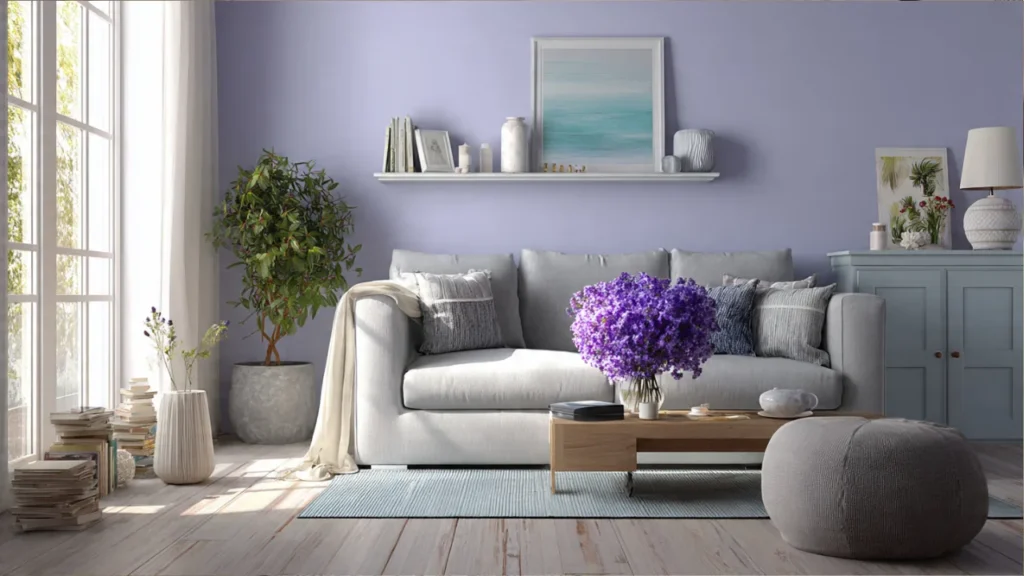
4. Soft Lavender – Subtle Sophistication
Lavender combines the calming properties of blue with the gentle warmth of pink, creating a uniquely soothing atmosphere.
Best Shades:
- Pale lavender
- Lilac
- Misty mauve
- Dusty purple
Why It Works: Lavender has been used in aromatherapy for centuries to promote relaxation and better sleep. The color carries similar calming associations.
Design Tip: Use lavender on an accent wall paired with white or cream for a subtle, spa-like feel.
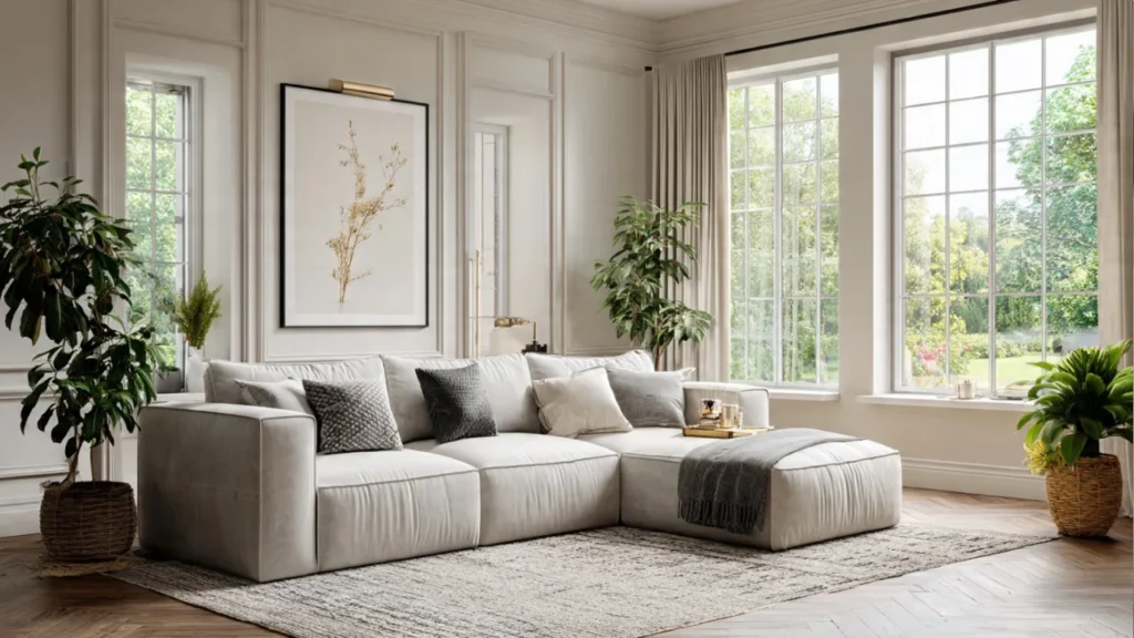
5. Creamy White – Clean Calm
Pure white can feel stark, but creamy, warm whites create an airy, peaceful environment that feels both clean and cozy.
Best Shades:
- Ivory
- Cream
- Off-white
- Eggshell
Why It Works: Warm whites reflect light beautifully, making spaces feel larger and more open while maintaining a gentle, welcoming atmosphere.
Design Tip: Mix warm white walls with natural textiles and wood tones to prevent the space from feeling cold or clinical.
6. Soft Beige – Timeless Comfort
Beige often gets overlooked, but this warm neutral creates an inherently cozy and grounding atmosphere.
Best Shades:
- Sand beige
- Oatmeal
- Biscuit
- Almond
Why It Works: Beige is universally comfortable and creates a sense of warmth without demanding attention, allowing your mind to rest.
Design Tip: Layer beige with deeper earth tones and plenty of texture to avoid monotony.
7. Pale Pink – Gentle Warmth
Soft, dusty pinks offer a contemporary take on relaxation, providing warmth and comfort without being overly sweet.
Best Shades:
- Blush pink
- Dusty rose
- Peach cream
- Ballet pink
Why It Works: Pink has been shown to have a calming effect on emotions and can even reduce aggression and anxiety.
Design Tip: Ground pale pink with charcoal gray or navy accents for a modern, balanced look.
Colors to Avoid for Relaxation
While personal preference matters, certain colors are generally not recommended for relaxing living spaces:
- Bright Red: Increases heart rate and can feel overstimulating
- Vibrant Orange: Can be too energizing for relaxation
- Neon Colors: Visually jarring and stress-inducing
- Dark Black: Can feel oppressive in large amounts
- Stark White: May feel cold and clinical without proper styling
Tips for Choosing Your Perfect Relaxing Color
Consider Your Lighting
Natural and artificial lighting dramatically affect how colors appear:
- North-facing rooms benefit from warm colors
- South-facing rooms can handle cooler tones
- Test paint samples at different times of day
Think About Your Space Size
- Small living rooms: Light, cool colors make spaces feel larger
- Large living rooms: Can handle deeper, richer relaxing tones
- Low ceilings: Lighter colors create height illusion
Match Your Personal Style
- Minimalist: Stick to soft whites, grays, and single accent colors
- Coastal: Blues, aquas, and sandy neutrals
- Scandinavian: Warm whites and soft grays
- Bohemian: Sage greens, terracotta, and muted earth tones
Use the 60-30-10 Rule
- 60% dominant color (walls)
- 30% secondary color (upholstery, curtains)
- 10% accent color (pillows, artwork)
How to Implement Relaxing Colors in Your Living Room
Start with Paint
The most impactful and cost-effective way to introduce relaxing colors is through wall paint. Consider:
- All walls in one soothing color
- One accent wall in a slightly deeper shade
- Two-tone walls with chair rail separation
Add Through Textiles
If painting isn’t an option, incorporate calming colors through:
- Sofas and armchairs
- Curtains and window treatments
- Area rugs
- Throw pillows and blankets
Incorporate Natural Elements
Enhance relaxing colors with:
- Wood furniture in light or medium tones
- Natural fiber rugs (jute, sisal)
- Stone or ceramic accents
- Indoor plants for living greenery
Control Your Lighting
Proper lighting enhances relaxing colors:
- Use warm LED bulbs (2700K-3000K)
- Add dimmer switches for ambiance control
- Layer lighting with floor lamps, table lamps, and overhead fixtures
- Consider soft, diffused lighting rather than harsh overhead lights
Color Combinations for Ultimate Relaxation
Combination 1: Coastal Calm
- Main: Soft blue
- Secondary: Warm white
- Accent: Sandy beige
Combination 2: Organic Serenity
- Main: Sage green
- Secondary: Cream
- Accent: Warm wood tones
Combination 3: Modern Tranquility
- Main: Warm gray
- Secondary: Soft white
- Accent: Muted blush pink
Combination 4: Scandinavian Peace
- Main: Warm white
- Secondary: Light gray
- Accent: Black and natural wood
Common Mistakes to Avoid
- Too many colors: Stick to 2-3 main colors to maintain tranquility
- Ignoring undertones: Cool undertones with warm undertones can clash
- Forgetting about finishes: Matte and eggshell finishes are more calming than high-gloss
- Not testing samples: Always test colors in your actual space
- Overlooking the ceiling: A painted ceiling in a complementary soft tone adds cohesion
Frequently Asked Questions
Q: What is the single most relaxing color for a living room? A: Soft blue is scientifically proven to be the most universally relaxing color, as it can lower blood pressure and heart rate.
Q: Can I use gray without making my living room feel cold? A: Yes! Choose warm grays with beige undertones (greige) and layer with warm textiles and wood elements.
Q: Are dark colors ever relaxing? A: Deep, muted colors like charcoal, navy, or forest green can be relaxing when used thoughtfully with proper lighting and balanced with lighter accents.
Q: How do I make a small living room feel both relaxing and spacious? A: Use light, cool colors like soft blue or pale gray on walls, maximize natural light, and keep furniture minimal.
Q: Should my living room color match the rest of my home? A: While cohesion is nice, your living room can have its own relaxing color palette as long as the transition between rooms isn’t jarring.
Conclusion
Creating a relaxing living room starts with choosing the right colors. Whether you opt for the scientifically-proven calm of soft blue, the natural serenity of sage green, or the modern sophistication of warm gray, the key is selecting hues that resonate with you personally while promoting tranquility.
Remember that relaxation is deeply personal—what soothes one person might not work for another. Use this guide as a starting point, test your chosen colors in your space, and don’t be afraid to trust your instincts. Your living room should be a reflection of your ideal peaceful retreat.
Ready to transform your living room into a calming oasis? Start by selecting your favorite relaxing color from this guide and begin your journey to a more peaceful home today.
Additional Resources
- Color psychology research from interior design experts
- Paint brand color matching tools
- Professional interior design consultations
- Before and after living room transformations
Keywords Density Check:
- relaxing living room colors ✓
- calming colors ✓
- peaceful living room ✓
- soothing colors ✓
- color psychology ✓
Word Count: ~1,800 words (Optimal for SEO)
Readability Score: Easy to read, conversational tone
Internal Linking Opportunities: Link to related content about furniture selection, lighting design, and home wellness
Also Read: Modern Small Bedroom Interior Design with Wardrobe: Space-Saving Ideas for 2025