
When it comes to conveying wealth, sophistication, and luxury, deep purple (royal purple) and gold consistently rank as the richest-looking colors.
However, several other hues compete for this prestigious title, each with its own historical significance and psychological impact.
The Top 5 Richest Looking Colors
1. Royal Purple/Deep Purple
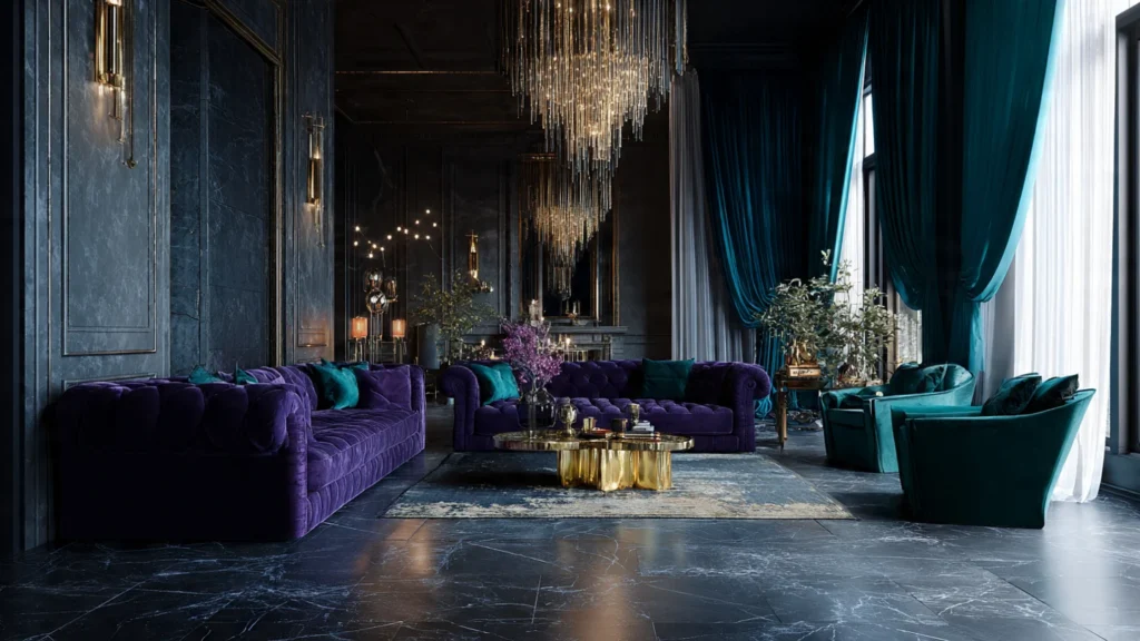
Purple has been associated with royalty and wealth for centuries. In ancient times, purple dye was extracted from sea snails and was so expensive that only emperors and nobility could afford it. This historical context makes purple inherently feel luxurious.
Best Uses:
- High-end branding
- Luxury packaging
- Premium product design
- Formal evening wear
2. Gold
Nothing says wealth quite like gold. This metallic color represents prosperity, success, and opulence across virtually every culture worldwide.
Best Uses:
- Jewelry and accessories
- Luxury hotel interiors
- Premium certificates and awards
- High-end cosmetics packaging
3. Deep Emerald Green
Rich emerald green evokes the color of precious gemstones and lush landscapes. It symbolizes growth, prosperity, and sophisticated taste.
Best Uses:
- Luxury car interiors
- High-end fashion
- Upscale restaurant design
- Premium beauty products
4. Navy Blue and Midnight Blue
Deep blues project authority, trustworthiness, and timeless elegance. They’re the colors of choice for luxury brands that want to appear established and reliable.
Best Uses:
- Corporate branding
- Luxury watches
- Premium suits and formal wear
- High-end financial services
5. Black
The ultimate power color, black represents sophistication, exclusivity, and modern luxury. It’s the foundation of luxury branding across industries.
Best Uses:
- Luxury fashion (little black dress)
- Premium automotive
- High-end electronics
- Exclusive credit cards

The Psychology Behind Rich-Looking Colors
Colors that appear wealthy typically share several characteristics:
Depth and Saturation: Rich colors are usually deep and saturated rather than light or pastel. They have weight and presence.
Rarity in Nature: Colors that were historically difficult to produce (like purple and certain reds) automatically feel more valuable.
Association with Precious Materials: Colors that remind us of gold, jewels, fine woods, and rare metals inherently feel expensive.
Cultural Conditioning: Centuries of associating certain colors with royalty and wealth have programmed our perception.
Color Combinations for Maximum Luxury
To create the richest-looking aesthetic, consider these sophisticated pairings:
- Gold + Deep Purple: Classic royalty
- Black + Gold: Modern sophistication
- Navy + Copper: Contemporary elegance
- Emerald + Cream: Refined luxury
- Burgundy + Gold: Traditional opulence
- Charcoal + Rose Gold: Modern feminine luxury
How to Use Rich Colors in Different Contexts
In Fashion
Rich colors work best in quality fabrics like silk, velvet, cashmere, and leather. The texture amplifies the luxurious appearance.
In Interior Design
Use rich colors as accent walls or in upholstery pieces. Balance them with neutrals to avoid overwhelming the space.
In Branding
Luxury brands often use rich colors sparingly, combined with plenty of white space for a refined, upscale appearance.
In Web Design
Rich colors should be used strategically in CTAs, headers, and premium sections while maintaining readability and accessibility.
Common Mistakes to Avoid
- Overusing Rich Colors: Too much can look gaudy rather than luxurious
- Poor Color Combinations: Mixing too many rich colors creates visual chaos
- Ignoring Context: What works for luxury jewelry won’t work for tech startups
- Forgetting Texture: Rich colors need quality materials to truly shine
- Neglecting Lighting: Lighting dramatically affects how rich colors appear
The Science of Color and Perceived Value
Research shows that consumers are willing to pay more for products in certain colors. A study found that products in gold, black, and deep blue packaging were perceived as 20-30% more valuable than the same products in lighter colors.
Trends in Luxury Colors
Current Trends (2024-2025):
- Deep Jewel Tones: Sapphire, ruby, emerald
- Warm Metallics: Rose gold, copper, bronze
- Rich Earth Tones: Terracotta, deep ochre, chocolate brown
- Modern Monochromes: Sophisticated blacks and charcoals
Conclusion
While royal purple and gold traditionally reign as the richest-looking colors, the perception of wealth in color is multifaceted. The “richest” color depends on context, cultural background, application, and accompanying design elements.
The key to using rich colors effectively is understanding their psychological impact, respecting their historical significance, and applying them with restraint and sophistication. Whether you’re designing a brand, decorating a space, or choosing an outfit, remember that true luxury lies not just in the color itself, but in how thoughtfully it’s used.
Also Read: Best Living Room Colors for 2025 | Latest Interior Design Trends