
When it comes to creating an impression of luxury and sophistication, color choice is far from arbitrary. Certain hues have been psychologically and culturally associated with wealth, exclusivity, and premium quality for centuries.
Understanding which colors convey expense can transform everything from your personal brand to your product packaging, interior design, or wardrobe choices.
The Timeless Elegance of Black
Black stands as the undisputed champion of expensive-looking colors. This powerful hue dominates the luxury fashion industry, from Chanel’s little black dress to high-end automotive finishes. Black conveys sophistication, mystery, and timelessness. Its ability to make other colors pop while maintaining a sleek, minimalist aesthetic makes it invaluable in luxury branding. Premium brands like Prada, Tom Ford, and Mercedes-Benz have built empires around black’s inherent elegance. The color’s association with formal wear, exclusive evening events, and high-end products has cemented its position as the color of affluence.
The Regal Power of Deep Jewel Tones
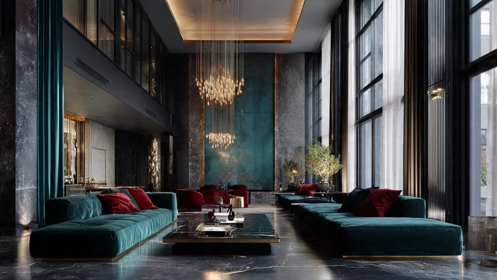
Emerald green, sapphire blue, and ruby red—these jewel tones carry an inherent sense of value because they’re literally named after precious gemstones. Deep emerald green evokes wealth through its connection to both gemstones and American currency. Sapphire blue suggests depth, trust, and exclusivity, which is why it’s favored by luxury hotels and high-end financial institutions. These saturated, rich colors require quality materials to reproduce accurately, which automatically elevates any product or design that features them. The depth and intensity of jewel tones communicate that no expense was spared in their creation.
Gold and Metallic Finishes: The Ultimate Status Symbols
Gold remains the most obvious color choice for conveying luxury, with its direct connection to wealth, royalty, and precious metals. However, the key to using gold effectively lies in restraint—too much appears gaudy, while strategic accents suggest refined taste. Rose gold has emerged as a modern luxury favorite, offering warmth and contemporary elegance. Silver and platinum finishes convey sleek, futuristic sophistication. Metallic colors work because they literally reflect light, drawing the eye and creating visual interest that flat colors cannot match. Luxury tech companies like Apple have mastered the art of metallic finishes to justify premium pricing.
The Purity of Crisp White and Cream
White and cream colors signal luxury through their association with cleanliness, purity, and the impractical—after all, maintaining pristine white requires resources and care. High-end minimalist design leverages white space to create breathing room and focus, suggesting that the brand doesn’t need to cram in information because their quality speaks for itself. Cream and ivory variations add warmth while maintaining sophistication, often seen in luxury hotels, high-end stationery, and premium cosmetics packaging. These light neutrals also serve as the perfect canvas for other luxury colors, allowing them to shine while maintaining an overall sense of refinement.
Navy Blue: The Corporate Power Color
Navy blue strikes the perfect balance between approachable and authoritative, making it a favorite in luxury business contexts. This deep, stable hue conveys trustworthiness, expertise, and established success. Premium financial institutions, law firms, and luxury consulting companies favor navy because it communicates professionalism without the starkness of black. When paired with gold or crisp white, navy creates a classic luxury combination that never goes out of style. The color’s versatility allows it to work across industries while maintaining its expensive appearance.
Burgundy and Deep Wine Tones
Rich burgundy, oxblood, and wine colors evoke luxury through their associations with fine wine, leather goods, and historical aristocracy. These colors have substance and weight, suggesting quality materials and careful craftsmanship. Luxury leather goods brands frequently use burgundy because it showcases the depth and richness that only premium leather can achieve. The color also has a timeless quality—it never looks trendy or cheap, instead conveying established taste and discernment.
Blush Pink and Soft Pastels Done Right
While pastels can sometimes appear juvenile, sophisticated versions of blush pink, soft lavender, and pale blue can convey modern luxury when executed properly. These colors work best when they’re dusty or grayed-down rather than bright, creating a sense of understated elegance. High-end beauty brands have embraced millennial pink and similar soft tones because they suggest femininity, delicacy, and premium self-care. The key is pairing these softer colors with luxury materials—think blush velvet, not plastic pink.
The Psychology Behind Expensive-Looking Color Combinations
The most luxurious color palettes don’t rely on single colors but rather on sophisticated combinations. Classic pairings include black and gold, navy and cream, or deep green and brass. These combinations work because they create contrast and visual interest while maintaining harmony. Monochromatic schemes in deep, saturated tones also convey luxury by showing restraint and intentionality. The trick is avoiding anything too bright, garish, or artificial-looking—expensive colors tend to be complex, with subtle undertones that add depth.
Ultimately, the most expensive-looking colors share common characteristics: depth, complexity, and timelessness. They’re colors that look better in quality materials and that don’t try too hard to grab attention. Whether you’re designing a brand, decorating a space, or building a wardrobe, choosing these sophisticated hues will elevate your aesthetic and communicate value, quality, and refined taste.